Anytime and anywhere
insight
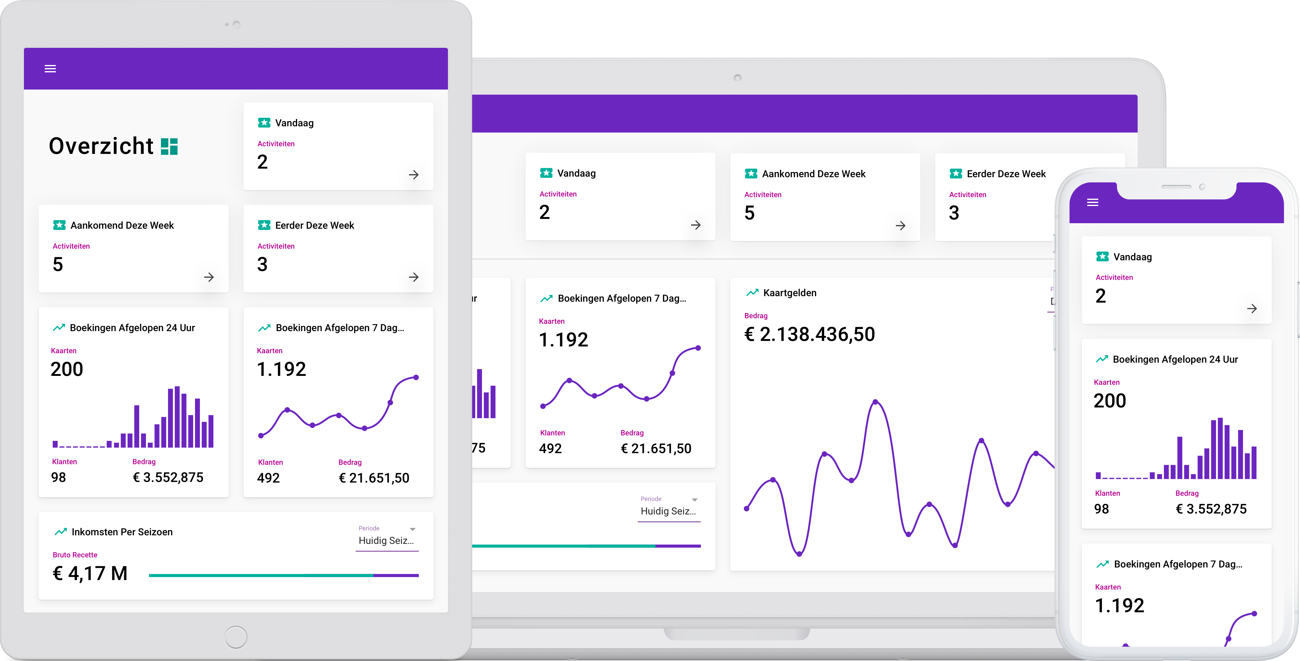
The Ovatic Dashboard gives you a real-time overview of your visitors, revenue and activities — on your desktop, tablet or phone. No spreadsheets, no separate reports, just one screen with everything you need to know.
One screen, all the figures
Everything you need daily to run your organisation, in one place.
Visitors
How many visitors can you expect this weekend? See per day, per activity and per location how many tickets have been sold and what the expected occupancy is.
Revenue
View your revenue per day, week, month or season. From received payments to outstanding payment requests — you know exactly where you stand.
Activities
Which performances, films or events are planned? How are they performing in terms of sales? Which are going well and where is extra attention needed?
Outstanding actions
Payment requests still outstanding, bookings that need to be confirmed, or activities that need attention. Everything together, nothing overlooked.
Built for on the go
The dashboard is designed for mobile devices. The same information, the same speed, adapted to your screen. Check the occupancy on your phone while walking through the building, or view the weekly figures on your tablet during a meeting. The experience seamlessly matches what you're used to from other apps.
- Works on desktop, tablet and phone
- No app needed — just your browser
- Always the most current data
- Same experience on every screen
Give your entire team insight
The dashboard is not just for the director. Give staff access to the information relevant to their role. Use it as a tool in presentations, in team meetings, or let the programmer check the season's sales figures themselves. Everyone works with the same figures.
- Access for all staff members
- Role-based views
- Suitable for presentations and meetings
- Always current data, no outdated exports
Director
All figures and reports
Programmer
Activities and occupancy
Box office
Daily revenue and payment requests
Marketing
Sales per channel and campaign
Your input, our dashboard
The layout of the dashboard was determined in collaboration with our customers. Through surveys and interactive prototypes we jointly established what you want to see first and how the information should be organised. We continue to do this — as a user you have direct influence on new features.
Surveys
We regularly ask what you miss or want to improve.
Prototypes
New features are tested with real users.
Direct influence
Your feedback helps determine which features we build.
Curious what it looks like?
Schedule a demo and we'll show you the dashboard live with real data.